Friday, October 29, 2010

Laundry List

Where do you focus your decorating energy in your home? We all know "kitchens and baths sell houses" (unless of course you are a super-talented DIYer who wants beat up bathrooms and kitchens to remodel yourselves!) so they tend to be decorated to your liking first. Most people answer with any number of the rooms that guests spend time. Others focus on the rooms where they spend the most time themselves. But what about the laundry room? Many of us spend way more time than we would like to admit in our laundry rooms (unless you have a rockstar husband who does the laundry!). Many of us have our washer and dryer in a mud room where everyone enters the house. So, why should you treat this room with any less decorating savvy than all the rest?? Besides, it could make a less-than-fun chore, a little more bearable!

Here of some of my favorite droolworthy laundry rooms:


all images via Decorpad
And last but not least, my FAVORITE one:
I love the color of the washer and dryer, I love the style of the cabinets, I love the wallpaper, I love the hangers, I love the stairs, and I love love LOVE the chandelier! I got the pic from Decorpad but I believe this beauty actually belongs to a fellow blogger, Saucy.

Okay, now you've seen the beauty so it's time for me to complain for a minute. The one thing I cannot STAND about all of these laundry rooms (unfortunately) is they all have front-load washers. It's totally the fault of my father's brainwashing but I am not a fan of the front-load washers. I always get the water going and add detergent BEFORE the clothes go in so I'm not sure that's a habit I can kick. I also have a habit of needing to add another shirt or a random sock I left behind once the washer has started going. How are you supposed to open a door filled with water?? My Dad also taught me that front-load washers are bacteria breeders. It's TRUE, and it causes a moldy SMELL if you're not careful. Thif youere is a product you can buy called "smelly washer" that will get rid of the smell but I couldn't tell you if it helps the actual mold/bacteria problem or not. Have any of you tried it? Does anyone out there agree with me??


And if you don't have a huge room or a lot of money to spend, here are a few great tips:

  • Paint the walls (or use wallpaper or a stencil for added interest)

  • Hang a picture, a small piece of artwork or a sign

  • Replace wire metal shelving with inexpensive cabinets from a hardware store, or use solid wood shelves and storage bins that match

  • Replace your light fixture with something more decorative

  • Buy a pretty ironing board cover and display it instead of hiding it away (try Etsy)

  • ORGANIZE

This room is less extravagant but equally as beautiful!


So...did I strike a nerve with anyone? Do you agree? Have you recently done a laundry room makeover in your own home? Please share!

Blog Love + Vote!

PS...I'm sending out some Blog Love today.
One of the many blogs I love is Three Men and a Lady.

If you haven't checked it out before, you are missing out! Michelle has great style and ideas, and always seems to be positive and in a great mood! Why does that matter? Because she is trying to win YOUR votes to be the next blog writer for the Good Mood Blog. Head over to learn about SAM-e, see what the blog is all about, VOTE for Michelle, and try the Mood Quiz to see if you are as big of a happy-go-lucky optimist as you think you are!

Vote for Me


Good Mood Gig from SAM-e

Tuesday, October 26, 2010

Two Birds: One Stone

I killed two birds with one stone and I'm going to show you how I did it. (Not literally, I promise!)


My desk at work (at my "9 to 5" job ...which is NEVER 9:00 to 5:00 so why do I call it that??) is a desk in an open area. It sits outside my office with a window and a door that closes (where I only sit about once or twice a week). I can't keep a plant or real flowers at this desk because there's no sunlight and they would die very quickly so I have had the same fake flowers on my desk for almost 8 years. Well, maybe only as long as I've been in my current building so let's say 5 years. Needless to say, I have grown tired of these flowers. They are also orange and don't go with my stuff unless my Autumn and Halloween decorations are out. So, I gave them to a co-worker.


I have another problem which I'm sure a lot of people can relate to. Being that I'm in an open area, people always steal my stuff (mostly pens). I try to keep a separate stash of pens and pencils I don't care about so that when they disappear I don't care as much - but it gets expensive because I constantly have to replace them. And since I'm OCD, they have to match the decor so they can't be any old pens or pencils.


My solution:


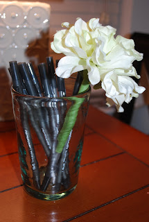
I made flower pens! They are great! I have to admit, I don't like them separately because they look a little juvenile. But when grouped together, they look like a pretty decent bunch of (fake) flowers! Now, when people "borrow" a pen, most of them are guys and won't want to hang on to it. The rest of them who do take it, won't be able to claim it's theirs when I catch them with it!


Start off with regular stick pens. DON'T use click pens!
Cut the stem of the flower to the length you prefer. I tried several different lengths but never past the soft grip of the pen.

Use floral tape (I used green to make it look more like a flower stem) and wrap the pen and stem closely together...all the way down to the end of the stem and all the way back up to the top.


et voila! It's that easy!

Repeat until you have enough flowers to fill a cup or vase. If you want the look of an arrangement, it would be better to use different pens of different lengths. I used the same pens so they would match.
The finished product resting on my Colin Cowie Bible.
(Seriously, the book is my hostessing, organizing BIBLE)

Monday, October 25, 2010

Boo!

Our first full weekend in our new place and we got next to nothing accomplished! But, I did put out a few Halloween Decorations and thought I'd give you a glimpse.
I can't show you the whole thing zoomed out because that would reveal the boxes and clutter everywhere! We picked the pumpkins at Cox Farms a few weekends ago. LOVE that place!

Wednesday, October 20, 2010

Use of Yellow

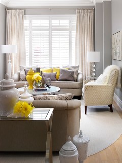
We moved into our apartment last Saturday (yay!) and we are slowly settling in. There are still boxes to unpack and it will take me a while to make sure everything has a place. So my mind is going full speed ahead planning how to use what I've got to decorate the place, and what to look for when I'm out and about that could really spruce things up a bit. For the master bedroom, I've had my eye on a dark charcoal grey quilt from West Elm. I'm really in love with the grey & yellow combo these days but I haven't gotten around to using it just yet.

I created a little Ideabook on Houzz to help inspire me. Check it out!


Decor by Jennifer Inc contemporary family room

Tuesday, October 19, 2010

Lust for Less!

It's been a few weeks since I've done a LUST LIST item or a Luxe for Less. I thought a good follow-up to my Jonathan Adler post last week would be to do a Jonathan Adler look for less.

Lo and behold: Decorpad featured such an item!


$2750

via


$599

PS - Head on over to Jonathan Adler now to take advantage of their FIRST ever Annual Lighting Event! 15% Off!

Thursday, October 14, 2010

Jonathan Adler

All this talk about Jonathan Adler lately. There's a new line of Jonathan Adler stuff on HSN which is probably what sparked the hype. I have to agree, there are a few things that caught my eye but I'm really drawn to some of his stuff that is not on HSN.


Rugs:


Wallpaper:


And even if you don't appreciate the beauty of his furniture and accessories, you have to love the wisdom and humor in the Jonathan Adler Manifesto:

"We believe that your home should make you happy. We believe that when it comes to decorating, the wife is always right. Unless the husband is gay. We believe in carbohydrates and to hell with the puffy consequences. We believe minimalism is a bummer. We believe handcrafted tchotchkes are life-enhancing. We believe tassels are the earrings of the home. We believe in our muses: David Hicks, Alexander Girard, Bonnie Cashin. Hans Coper, Gio Ponti, Andy Warhol, Leroy Neiman, Yves Saint Laurent, and Madonna.We believe in the innate chicness of red with brown. We believe in being underdressed or overdressed always.We believe in infantile, happy emblems like butterflies and hearts. We believe celebrities should pay full price. We believe in rustic modernism: Big Sur, A-Frame beach houses,raw beams, and geodesic dome homes. We believe in Palm Beach style: Louis chairs, chinoiserie, Lilly Pulitzer, The Breakers circa '72. We believe our designs are award winning even though they've never actually won any. We believe in Aid to Artisans. We believe dogs should be allowed in stores and restaurants. We believe in mantiques - suits of armour, worn chesterfield sofas, heraldic tapestries. We believe you should throw out your Blackberry and go pick some actual blackberries. We believe colors can't clash. We believe in blowing your nest egg on our pots. We believe our lamps will make you look younger and thinner.We believe in irreverent luxury."


A few people have asked, so I thought I would explain. The manifesto does not contain the coloring and bolding. I added color and bold to parts and phrases that I particularly agree with or find interesting or funny. Sorry for any confusion!! ~K


It's a Blog Hop! Join in by adding your blog post on Jonathan Adler below!

Tuesday, October 12, 2010

Obsession Confession

As someone with OCD, I tend to obsess over lots of things. I like to blog about my obsessions and give the occasional honorable mention here and there. Lots of my obsessions are design related, or have become design related. I feel quite proud of myself when the things I obsess over become big fashion trends instead of obsessing over a current fashion trend. I'd like to think of myself as a leader, not a follower.


So, today's Obsession Confession (I may make this a regular thing) is ZEBRA PRINT. I think I originally fell in love with zebra print because of the black and white, but I love it in brown & ivory for decorating. KM is thinking of using a brown zebra rug for her family room re-do and I could not be more jealous!


Take a looksy at some tasteful zebra decor:


Images from Decorpad

Monday, October 11, 2010

Latest Love:Lonny

I pride myself on not being a "collector" of things. I like clean, paired down, zero chotchkies, etc. But I also have a problem with getting rid of things. I find myself saying "I might need that someday". Very annoying. But I'm getting better, I promise! One thing I can't seem to part with is magazines. My house growing up was filled with magazines and catalgoues. (*Mirror, Mirror on the wall...I am my Mother afterall*) My house now (correction: my storage unit now) is filled with magazines. Mom has a good excuse- she is a designer and she uses them for reference and inspiration. I too have an excuse: I am a wedding planner (who just got done with planning her own wedding a few months ago!) so I use them for reference and inspiration, and I loan them out to friends and clients.


It's a bad habit. or maybe a guilty pleasure?

For me, it's just another reason to LOVE LONNY. Of course, you can buy the print version of the ultra fab Lonny Magazine, but the online format *swoon* is F-R-E-E! They just celebrated their one year anniversary and it can only get better.


The latest issue has a really great spread on designer Palmer Weiss. There's a quote from her I am totally going to steal because I say it all the time! "I truly wanted a calling, not just a job"

And for all you design-loving mommys out there, check this out!


Here are a couple images I love from Lonny's latest issue.


If you haven't read Lonny before, you're truly missing out!

I'm linking up! To 6th Street Design School. Head on over to check out Kirsten's Lonny blog post and visit other bloggers' posts about Lonny.

Sunday, October 10, 2010

Mom Cave


Any of you LADIES have a "Man Cave" in your house, but don't have a space of your own? HomeGoods has teamed up with designer Elaine Griffin to giveaway a mancave for moms - a "Mom Cave"!

I am not yet a mom but I love a space to call my own (that is not the kitchen or any other common area of the house). I imagine when we have kids that I will want a husband-free & kid-free mommy zone.
If I had my own "Mom Cave"...
1. It would be connected to a crafting/work space but not combined. (if there was enough room)
2. It would be comfortable and chic.
3. It would have enough seating to entertain my fabulous girlfriends, but small enough to still feel cozy when it's just me.
4. It would always have candles, fresh flowers and at least one bottle of wine at the ready.
5. It would have a secret stash of chocolate.
6. A fireplace would be amazing.
Do any of you have your own "Mom Cave"?

Saturday, October 9, 2010

I'm dreaming of a Tequila Christmas!...

I *heart* Neiman Marcus (and Horchow and Bergdorf's). The Neiman's Christmas Book just came out. The theme this year is 50 years of His & Hers. It's a super cute concept. I enjoy seeing what the big gift items are each year. Always things that are completely extravagant and 5-6 figure price tags or more - totally not in my price range. But, fun to look at! This year they have a 2011 Camaro - a Neiman Marcus edition Camaro. What do you think?


But my favorite gift item that I would LOVE for someone to give me? The party planned by none other than Colin Cowie himself!

Colin Cowie will plan a party for 75 guests in your home, Chef Todd English will cook up some divine delights for you to munch on, all while you sample Tequila Avion cocktails created by mixologist Yusef Austin and listen to the sounds of DJ Donna d'Cruz. All this can be yours for the budget-friendly price tag of $125,000.

*Keep Dreaming, Kat*


Check out the Neiman Marcus flip book online if you didn't get your own copy at home!

Wednesday, October 6, 2010

Mea Culpa

So, I had a super cute Fall craft project planned and I sat down to complete it Monday evening. It turned out really well and I took step-by-step pictures with the SLR so I could share with you! (I finally found the batteries and charger!) Just before bed, I got the camera out to review the pictures and discovered that I had no memory card in the camera and therefore, NO pictures. FAIL.


So, I put the memory card in and took one picture the next morning so you can get a sneak peak. I'll just have to do the project again so I can get some pictures to post!

Saturday, October 2, 2010

Related Posts with Thumbnails